Rendering the AI Mushaf
How we built Suhuf's Quran page renderer from scratch: the data model, the font strategy, and the justification engine that makes a phone screen behave like six centuries of print typography.
Suhuf renders each Quran page more like a game engine renders a scene than like a PDF viewer renders a page, and the difference isn't cosmetic: it follows directly from what the app needs the page to do. A PDF is, at its core, a description of ink on a surface. It can reproduce the shape of a letter with complete fidelity, but it carries no information about which pixels belong to which word, a distinction that a static document never needs and an interactive one cannot do without. Suhuf needs that distinction, because the app has to identify, at any moment, which glyph on screen corresponds to the fourth word of a given ayah, so it can light that word green the instant the reader recites it correctly, or wash an entire verse in a highlight the instant its audio begins playing.
None of that reacting, however, involves machine learning; the actual model-driven work in Suhuf, the recitation tracking and the revision scheduling, sits one layer above the renderer described in this post. What this post covers is the layer underneath, and typesetting a Quran page is a considerably stricter problem than typesetting an ordinary app screen. A mushaf page is a fixed print artifact rather than a flexible document: its line breaks are carried over from a specific historical print, either the 1405H or the 1421H edition, and every one of those lines is either full-width or centered. Its calligraphic headers and basmallahs function as decoration rather than as text that could be substituted or resized, and its orthography, the Uthmani script with its own diacritics and pause marks, cannot be reflowed the way a paragraph of English can. There is no acceptable way to truncate a verse with an ellipsis, drop a word because a line runs a little long, or wrap text wherever the screen happens to run out of room.
That constraint is what forces the five decisions this post walks through: how the page is modeled as data, which font strategy draws the ink, how a line gets justified without breaking the text, how the canvas is sized and capped, and how the ornamental typography, the headers and basmallahs, gets handled separately from ordinary text. Each of these decisions was wrong at least once in a way that only became visible once real editions shipped to real devices, and the final section of this post explains why getting all five precise enough to match print is also what allows the app to react to the reader, word by word, while it is being recited.
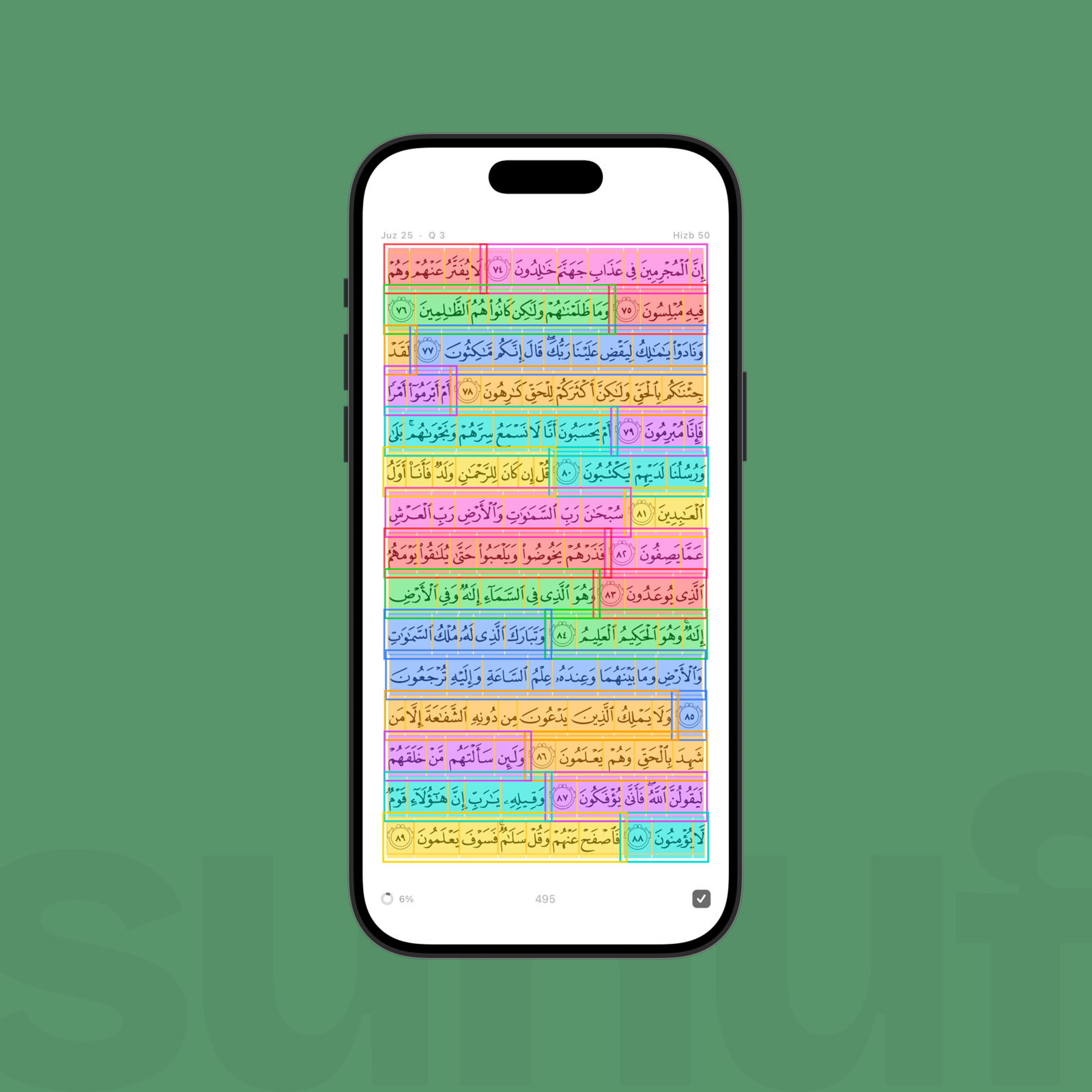
Every colored box corresponds to a row in the underlying line/word table, not to any freehand layout decision.
Step 1: the page is a table, not a paragraph
The foundational decision underlying everything else in this post is to model a mushaf page as rows in a table rather than as a block of Arabic text. Each row is a line, and each line carries a lineType (ayah, surah_name, basmallah), an isCentered flag, and, for ayah lines, the ID range of the words it contains. Because word IDs are global across the entire Quran rather than scoped to a single page, slicing out a page's text is a single range query rather than a per-line walk that would otherwise require one lookup per word.
We build this table once, offline, translating Quranic Universal Library (QUL) layout and word-text SQLite databases into a static JSON file that ships inside the app:
// app/scripts/generate-mushaf-data.mjs
for (const row of lineRows) {
  const words = []
  for (let id = row.first_word_id; id <= row.last_word_id; id++) {
    const w = wordMap.get(id)
    if (w) words.push(w)
  }
  return {
    lineType: row.line_type,
    text: words.join(' '),
    isCentered: row.is_centered === 1,
    ...(row.surah_number ? { surahNumber: row.surah_number } : {}),
  }
}
Two details in this generator only start to matter once the app has shipped to a real device. The first is that page counts are not a fixed constant: they vary from 548 to 1,890 depending on which print and line count a given edition uses, so nothing downstream in the codebase is allowed to hardcode the number 604 as if every edition agreed on it. The second is that every text transform the runtime could defer, we instead run once at build time: ayah-number markers, IndoPak's private-use-area verse codes, and a stray RTL-override character embedded in one particular ayah of Al-Fatiha are all baked directly into the emitted text, so the app never runs a regex pass over ~9,000 lines the first time it opens.
Step 2: three ways to put ink on the page
Once the words exist as data, the next decision is how to draw them on screen, and this is where the real tradeoffs of mushaf rendering live:
| Approach | What it is | Tradeoff |
|---|---|---|
| Unicode font | One .ttf, standard Arabic shaping |
Smallest footprint (~2–5MB), but you own line-breaking and justification yourself |
| Variable font (DigitalKhatt) | One Unicode-driven OpenType font with kashida-capable features (cv01–cv16) |
Same footprint; the font can stretch letterforms for you, but you still have to drive the OpenType features |
| Glyph-facsimile (QPC V1/V2/V4) | One .ttf per page, pre-justified to match the print |
Zero justification work, pixel-perfect to the mushaf. Codepoints are reused per page (the same glyph ID means a different letter on page 5 than on page 400), so fonts can't be merged or bundled, only fetched and cached |
Suhuf ships the third option, the glyph-facsimile approach, as its default: a bundled QCF (Quran Complex Font) edition whose per-page fonts are fetched on demand from our own storage and cached to disk rather than bundled into the app, since a full QPC V2 pack runs to ~200MB spread across 604 separate files. DigitalKhatt, the variable-font approach, remains available as a fallback for the handful of editions that don't yet have a per-page font pack built for them.
// app/scripts/generate-mushaf-data.mjs: per-edition font/layout pairing
{ name: 'madani_v1_qcf', bundled: true,  glyph: true,
  layout: layoutPath('qpc-v1-15-lines'),
  words:  wordsPath('qpc-v1-glyph-codes-word-by-word') },
{ name: 'indopak',       bundled: false, glyph: false,
  layout: layoutPath('qudratullah-indopak-15-lines'),
  font:   fontPath('DigitalKhatt-IndoPak.otf') },
There is also a duller but real compression story here. An earlier version of the generator baked per-word HarfBuzz shaping widths into every line, on the assumption that the renderer would want them. The renderer never read that field, and stripping it out dropped ~4.6MB across the seven asset files, weight that had been paid on every cold start for a value nothing in the app ever consumed.
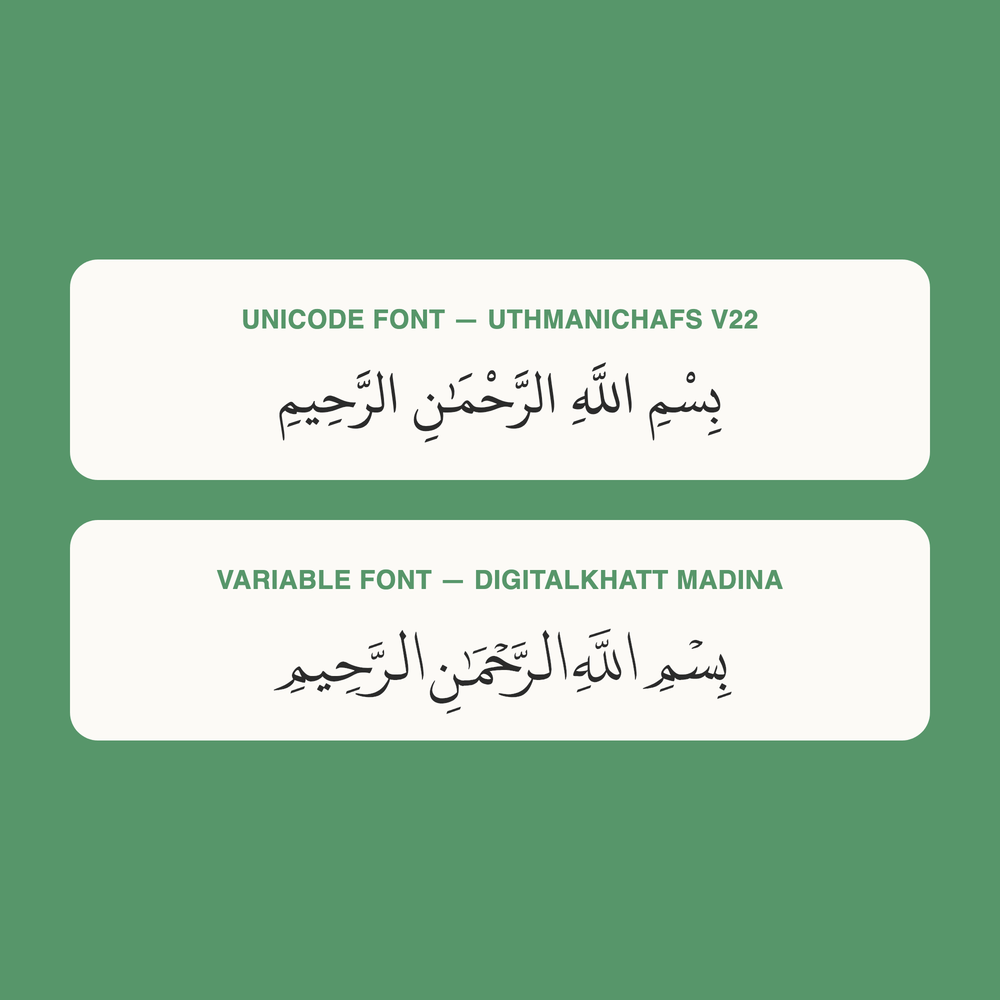
Same phrase, two of the three strategies from the table above. The Unicode font (top) shapes correctly but generically; DigitalKhatt (bottom) is built for exactly this script.
Step 3: justifying a line of scripture
A justified line of Arabic cannot add space between words the way English justification does, because inter-word gaps that wide look broken. The traditional answer is kashida, the practice of stretching a connecting stroke within a word rather than stretching the space between words. Getting this right in Skia required getting one thing wrong first: measuring text at the exact width you are trying to fit it into returns a useless number, because the paragraph engine's own line-breaking logic activates and changes what is being measured. The fix is to measure at an infinite width first, compare that measurement against the target, and only then decide how much the line needs to stretch or shrink.
Suhuf's justifier is built as an iterative search over that gap rather than as a single closed-form formula. It tries word-spacing first, then kashida features, and only turns to shrinking the font size as a last resort, with a hard floor: a line is never allowed to compress past 90% of its natural width before the algorithm gives up and accepts an imperfect fit:
// app/lib/mushaf/line-justification.ts
while (iteration < maxIterations) {
  const measuredWidth = measureWidth(text, fontFamily, currentFontSize, ...)
  const gap = contentWidth - measuredWidth
  if (Math.abs(gap) <= widthTolerance) {
    candidate = { para, scaleX: currentScaleX, wordSpacing: currentWordSpacing, ... }
    break
  }
  // else: grow word-spacing, then kashida, then shrink font, in that
  // order, then measure again.
}
Every call to measureWidth is cached, keyed by the text, the font, the size, and the exact set of kashida features applied, since color, alignment, and target width have no effect on the measured advance and can be left out of the cache key. Building a Skia paragraph, which involves font shaping, OpenType feature resolution, and native object allocation, is the expensive part of this process, and a 604-page book gets re-justified every time the reader resizes the text or switches editions, so the cache is doing real work rather than optimizing a rare code path.
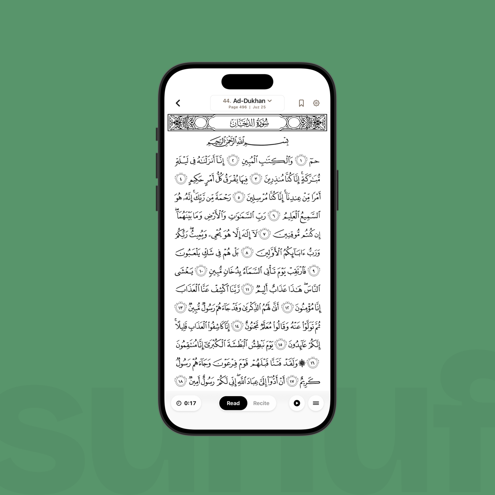
Every line on this page ends flush with the next, not because the words happened to fit, but because the loop above ran until they did.
Step 4: one canvas, sized from the bottom up
Each page renders as a single Skia canvas, though this was not the original design. An earlier version of the reader allocated one canvas per line instead, and we scrapped that approach because collapsing everything down to one canvas per page was one of the largest performance wins in the entire reader. Font size, in the current design, is derived from vertical space before it is derived from horizontal space: because a page has a fixed number of lines, the available height alone determines how large the text on each line can be, before width enters the calculation at all.
// app/lib/mushaf/layout-params.ts
export function deriveMushafFontMetrics(params) {
  const lineCount = getLineCount(params.edition)
  const slotHeight = params.contentHeight / lineCount
  const fontSize = (slotHeight / LINE_HEIGHT_RATIO) * clampMushafFontMultiplier(params.fontSizeMultiplier)
  return { lineCount, slotHeight, fontSize }
}
Width enters the calculation only afterward, and only as a ceiling rather than a driver: the available screen width is capped at the edition's own canonical print proportion (~17 em for the Madani editions, 17.5–24 em for IndoPak), and the resulting column is centered whenever that cap takes effect.
// app/lib/mushaf/layout-params.ts
export function deriveMushafTextColumn(params) {
  const padded = params.screenWidth - 2 * params.horizontalPadding
  const maxWidth = params.fontSize * getDKPageEmWidth(params.edition)
  const contentWidth = Math.min(padded, maxWidth)
  return { contentWidth, leftPadding: params.horizontalPadding + (padded - contentWidth) / 2 }
}
On a phone screen this cap functions as an identity operation, since the screen is never wide enough to trigger it. On an iPad, or in a landscape split-screen layout, the cap becomes active and prevents lines from stretching far wider than any printed mushaf ever was, which in practice is the difference between text that stays readable and a line that ends up carrying three inches of kashida stretch across a single word.
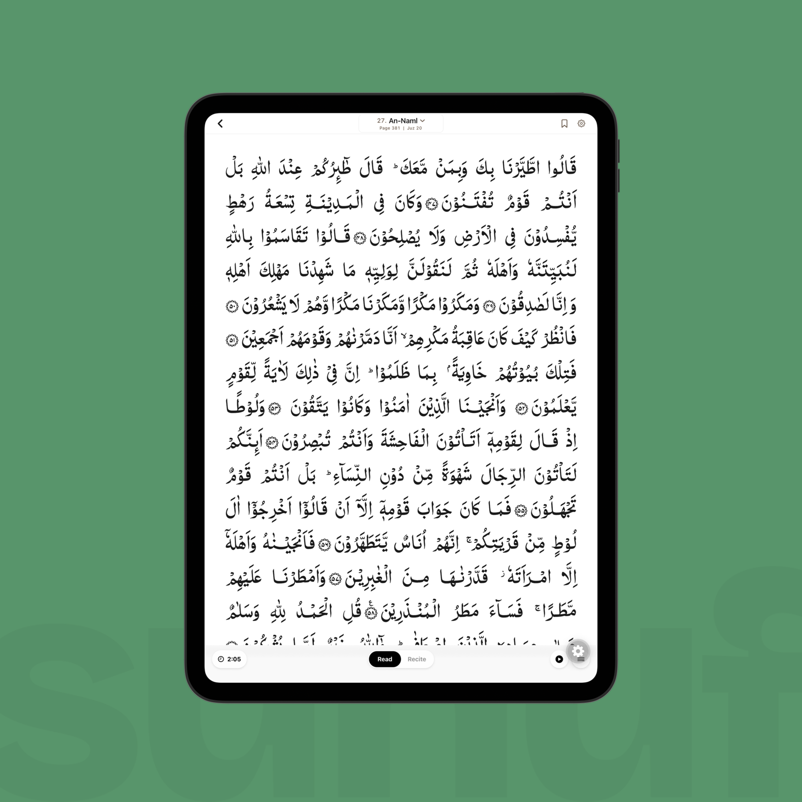
The margin on either side isn't empty space left over. It's the cap in Step 4 refusing to let the line stretch past what the print ever asked of it.
Step 5: the parts that aren't text
Surah header bars, the basmallah, and the juz and hizb markers are not typed Arabic at all, but ligature glyphs baked into dedicated ornamental fonts and triggered by typing exact literal strings that OpenType's liga feature then substitutes for a single decorative glyph. Typing "surah012", for instance, produces the calligraphic name of Surat Yusuf, and typing "header" produces the full-width decorative bar that name sits inside.
The basmallah itself differs depending on which print is being reproduced. The 1405H facsimile renders it as a single ligature glyph, while the 1421H and 1441H facsimiles compose it from four separate glyph segments laid out left to right, which fit together only because the font encodes large negative side-bearings on the joining glyphs: the renderer places four glyphs in a row, and the font's own metrics handle the rest of the composition:
// app/lib/mushaf/page-paragraph-builder.ts
if (fontFamily.startsWith('QPCV')) {
  const isV1 = fontFamily.startsWith('QPCV1')
  const bText = isV1 ? '﷽' : 'ﲪﲫﲮﲴ'          // one glyph, or four composed segments
  const bFamily = isV1 ? 'QuranCommon' : 'SurahNameV4'
  // isV1 sizes the single ligature to a calibrated width; the four-segment
  // version lays out as a normal RTL text run at body font size. The font's
  // own metrics do the composition.
}
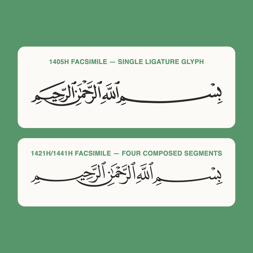
Same phrase, two different font mechanics. Neither of these is typed text: both are the literal output of the fonts described in the code above.
Step 6: why a page has to know its own anatomy
Every decision described so far in this post was made in service of visual fidelity, in service of matching a printed mushaf pixel for pixel, and that same body of work is also what recitation tracking depends on. Word bounds are not a separate feature built on top of the renderer: they are a direct byproduct of solving the justification problem described in Step 3.
Justifying a line already means measuring, in Skia, how wide every word is at its final kashida-adjusted, font-shrunk size, since that measurement is the whole justification loop, and once that information exists, reading off where on screen each word starts and ends costs almost nothing further:
// app/lib/mushaf/page-paragraph-builder.ts
function computeWordBoundsExact(
  text: string,
  justifiedLine: JustifiedLine,   // the SAME result Step 3 already produced
  startingAyah: number,
  ...
): RawWordBound[] {
  const words = parseLineIntoWords(text, startingAyah, wa)
  // measure each word using the exact kashida features and font size the
  // line was justified with. The glyph on screen and the rectangle the
  // tracker paints over come from one calculation, not two.
}
That is the actual payoff of building the renderer this way. Recite mode's on-device CTC forced-alignment engine emits a confirmed-or-mistake decision for each word in real time, keyed by the same word ID the renderer has maintained since Step 1, which means it never has to search the screen to find that word: it asks for a rectangle by that ID and receives one, because the renderer had already computed it while solving an entirely different problem. Listen mode relies on the same mechanism one level up, painting a ghost-fill over whichever ayah is playing, and tap-to-select performs the identical lookup again. In other words, recite mode, listen mode, and tap-to-select are three separate consumers of a single fact that the renderer maintains for its own internal reasons: every glyph on screen knows which word it belongs to.
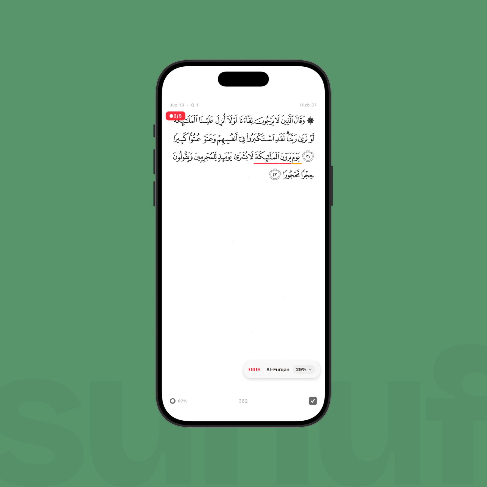
The underline is the tracker marking a specific word's rectangle live, mid-recitation, the same lookup Step 6 describes.
What shipping to five editions found
Legacy and Standard were pixel-identical for months. The 1405H "Legacy" edition was supposed to carry that print's own line breaks, but it had instead been wired to the 1421H layout database, meaning it shared the same word text and the same font as the Standard edition while reproducing the wrong line breaks, so that switching between the two editions in Settings changed nothing about what appeared on screen, and did so without ever crashing or throwing a visible error. We only found the bug by diffing the two layout databases page by page, which turned up ~35 pages where the two real prints disagree about where a line, or occasionally an entire surah header, falls.
The justifier squeezed facsimile lines that needed no squeezing. The justification path, in its original form, had no branching at all for glyph-facsimile (QCF) editions. Because glyph-coded text carries none of the Arabic-letter kashida features the justifier searches for, since the print itself is already pre-justified, every QCF line burned through its full eight-iteration search budget finding nothing to adjust, then fell back to a forced 90% horizontal squeeze that had been designed for genuine overflow, and it did so on every non-centered line, on every page:
// app/lib/mushaf/page-paragraph-builder.ts
const isQcfLine = fontFamily.startsWith('QPCV')
if (isQcfLine || line.isCentered) {
  // natural sizing only; scaleX compression still applies on overflow, but
  // there's no kashida search on text that has nothing to search for
} else {
  result = justifyLineToWidth(...)
}
The top bar remembered the wrong edition. After switching editions, the surah and juz name shown in the header would sometimes continue displaying the previous edition until the reader turned to the next page, because the font that finishes loading asynchronously was supposed to bump a counter that the header's data hook depended on. We had declared that counter as const [, setTick] = useState(0), which kept only the setter and discarded the value itself, so the re-render fired, but nothing depending on the tick's value could observe that it had changed.
What else this foundation carries
One more shipped feature is worth showing here, because it demonstrates the payoff from Step 6 again, from a different angle, and because it is easy to capture directly from the running app rather than needing any constructed comparison.
Long-pressing a verse or a single word opens a small floating card, positioned to avoid covering the very text it is attached to, which is only possible because the panel already knows the exact on-screen rectangle of that verse or word, the same geometry recite mode and listen mode consume. The card does two jobs from that one position: it looks up a translation or transliteration for the selected verse (The Clear Quran, by Dr. Mustafa Khattab, or a romanized reading), and it lets the reader pick a highlight color from a swatch, all without re-measuring anything the renderer had not already computed.
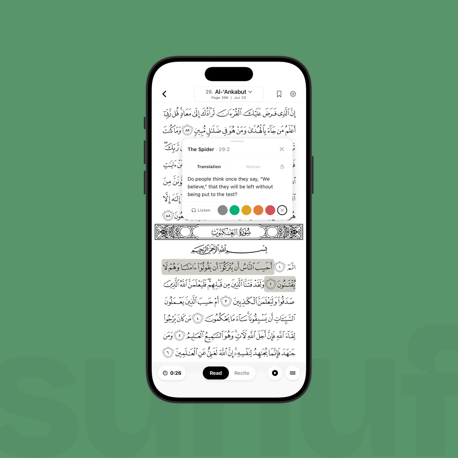
The panel opens already knowing which rectangle to avoid covering, because that rectangle was never a mystery to begin with.
A few verses later on the same page, after picking colors a few times, the highlights themselves are just as cheap to paint back: each colored line is the same word-bound rectangle from Step 6, filled instead of outlined.
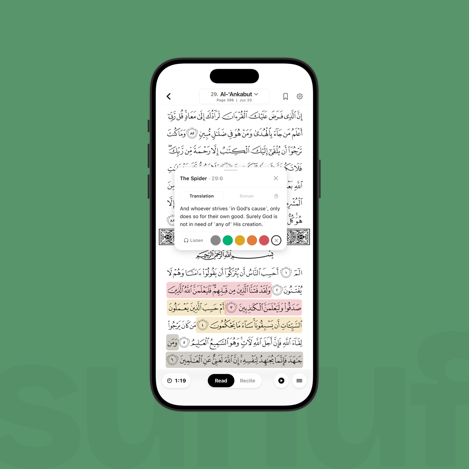
Every colored line here is a rectangle the renderer already knew about, not a new measurement.